What is Rotoscoping?
Rotoscoping is a technique which animaters use, tracing over footage frame by frame for use in live action and animated films. In the visual effects industry is the technique of manually creating a matt over a live action plate so that it can be replaced with another background. Its mostly used within animations.
The history of Rotoscoping
The technique was invented by a man named Max Fleischer who used rotoscoping in 1915 on a film named 'Out of the ink well' he created this with his brother Dave Fleischer dressed in a clown outfit as the live film reference for koko the clown.
Thursday, 19 December 2013
Project 1- Improved shots


We improved this shot by focusing the camera more on 'felix' so that the edge of the professors head is out of focus to show clearly that this shot has felix speaking to the professor. We got less of the professor in the shot so that its clear that the professor is talking to him but still focusing on felix.


For this shot i decided that introducing leading lines to the photograph to show clearly that the shot is aimed at the two characters in the middle. I also tilted the camera slightly from a lower angle so it makes the shot more interesting and individual. It also shows a clear foreground and background within the shot in comparison to the second one on the right hand side.

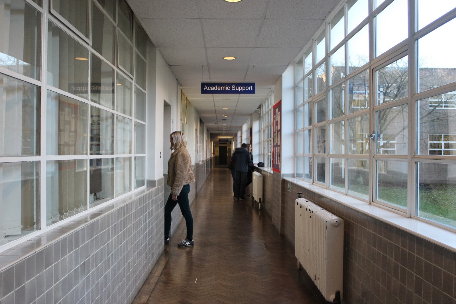 In this shot i believe that the newer shot to the left should be more of a close up of the character walking 'through a door' but this can easily be handled by putting the picture into photo shop and zoomed in so it looks like it is more of a p.o.v shot rather than a long shot. It is also a good shot because of the leading lines which focuses the viewer towards the character which is almost disrupting the leading line, breaking it leading the viewer to focus on the character rather than the hallway itself. The other shot also shows a good example of leading lines although the doorway is too focused considering it's meant to look like a closed door where as the improved shot on the left is not perfect but almost believable.
 This photo on the left shows a good example of focusing the camera on the 'Proffessor' and blurring the hallway to create an intentional shot that clearly shows that the photograph is focusing on the person in the shot talking. In comparison the the other shot which is out of focus and shot from an angle which in my opinion is too high so by lowering the angle slightly and having the camera at a diagonal improves the shot. Using leading lines on a diagonal also made the picture look more interesting rather than a flat straight on mid/over shoulder shot.
Wednesday, 18 December 2013
Matte Painting
What is Matte Painting?
A matte painting is used within films for a scene, background/ set to create an illusional environment that is non-existent or expensive and incredibly hard to create. Usually matte painting is combined with live action footage to create a realistic atmosphere.
The history of Matte Painting
Traditionally, Matte Paintings were made by artists using paints or pastels on large sheets of glass combined with live action footage. The very first Matte Painting shot was made in 1907 by a man named Norman (Norman Dawn) in the movie Missions of California.

Another early shot that included matte painting was in the wizard of oz when Dorothy approaches Emerald City. The wizard of Oz: produced by Metro-Goldwyn-Mayer, and the most well know and commercial adaptation based on the 1900 novel 'The wonderful wizard of Oz' by L. Frank Baum. In this particular shot, matte painting was used to draw attention to a completely abnormal yet realistic 'city' to add imagination to the idea of a large green city which is meant to be the heart of the movie. Obviously the software's and digital ability were not 100%; the way in which they have introduced the matte painting in the scene adds to the idea of almost a cartoon affect within the movie.
 By the mid 1980's advancements in computer graphics were made to then allow matte painters to include digital software's. Throughout the 1990's Matte paintings were still used but more often in conjunction with digital composting. Another film which shows a wide range of different Matte Paintings is 'Mary Poppins' (1964) when 'Mary' is 'flying' with her umbrella over the city in which she is about to be introduced to a family as a nanny. The way which the painter has drawn this background demonstrates how precise the painting itself has to be to allow live action footage. In this particular shot it shows the view of the city under thick clouds to then see Mary Poppins in the sky with an umbrella.

A matte painting is used within films for a scene, background/ set to create an illusional environment that is non-existent or expensive and incredibly hard to create. Usually matte painting is combined with live action footage to create a realistic atmosphere.
The history of Matte Painting
Traditionally, Matte Paintings were made by artists using paints or pastels on large sheets of glass combined with live action footage. The very first Matte Painting shot was made in 1907 by a man named Norman (Norman Dawn) in the movie Missions of California.

Another early shot that included matte painting was in the wizard of oz when Dorothy approaches Emerald City. The wizard of Oz: produced by Metro-Goldwyn-Mayer, and the most well know and commercial adaptation based on the 1900 novel 'The wonderful wizard of Oz' by L. Frank Baum. In this particular shot, matte painting was used to draw attention to a completely abnormal yet realistic 'city' to add imagination to the idea of a large green city which is meant to be the heart of the movie. Obviously the software's and digital ability were not 100%; the way in which they have introduced the matte painting in the scene adds to the idea of almost a cartoon affect within the movie.


Tuesday, 17 December 2013
Project 1-Good and bad shots
Bad


Good
 -I think that this shot is good; its a very plain shot which focuses attention on the characters rather than a cluttered background. Its also looks like he's engaging in conversation with the other character which is the type of shot that we were going for. It also fills up the frame which increases the attention drawn to the image. This means that theres not a lot of empty space within the picture so the viewers more focused on the things that are happening within the frame.
-This shot is good because i believe that it shows a good p.o.v shot as if the camera is the character walking through the hallway and narrates a typical friendship within a college. It is also a good shot because although there are leading lines again, it almost breaks those lines so that the focus is drawn to the two girls. Its also from a fairly high view which could imply that the character is looking down on the girls but the fact there is space to the right shows that there is space for 'felix' to walk into rather than the girls filling up the corridor with no room to move.
 -I personally like this shot because it shows a good example of rule of thirds. This is because there is a shoe in 1/3 the other lifted in 1/3 and lastly the space he is moving onto with a reflection and dirt on the floor which almost shows the viewer that it is a well lit area but not a well groomed area. I also like the angle that it is shot at because it brings mystery to the photo seeing as this is one of the first shots the viewer does not know who the character is, and is left judging the character on first impression by looking at the place which he is walking in, his shoes and the bottom of his trousers.
 -This longshot of college grounds is a good shot because i like the emptiness of the space. This being the very first shot it makes the viewer wonder why the car park is so empty, why the look of the college is so blunt and why even the sky is so grey. It also shows two different angles of the college by shooting it from a diagonal. The zebra crossing draws attention quickly by the boldness of the white colour in comparison to the rest of the college which looks dull.
 -This shot exaggerates the facial expression which the professor is meant to be pulling by a strongly focused close up of the expression. I think this could be even more exaggerated by focusing the camera more on his face and maybe even closer filling the frame to the maximum and blurring the background so it makes the viewer really wonder whats going on within the shot. It could have also been shot on a bit of a plainer background to enhance the character although i do like that a small part of the other characters face is within the shot so it is still clear that they are within conversation.

Tuesday, 10 December 2013
Different ways of moving clips from Premier to After effects
1.
File-export media - choose the settings that you would like to export the media as- choose the format- usually DVI/Quicktime but not recommended to use 'animation' because it takes up a lot of space- PNG
2.
Dynamic link connection- must save project if you make any changes, its not the sequence that becomes the asset, it's the project itself, next lasso all the clips together- right click- replace with after effects composition. It will send the whole combination of different clips and transform them into one full sequence. Create the new project which is now in after effects, name it, and save.
3.
Select all the clips, hold and drag the clips holding alt which will duplicate the clips to wherever you drag it and take one sequence dragging it into after effects which keeps the original 3 clips and transforms another copy into after effects with a complete sequence.
Sunday, 8 December 2013
Star wars green screen analysis
http://www.youtube.com/watch?v=NQxrJBNQg4A
The green screen for most of this film but especially this scene was used to show the viewer a different world to their own. It was used to create the impossible realistic and to keep the fight within an interesting environment so that the viewer stays attached to the scene and keep the idea of each character not being 'human' and living in an un-natrual world to their own. It was used to create the scenery within the fight between each character and to create the back drop realistically rather than modeling the whole scene by hand. Personally i believe that the film/scene is not realistic at all but exaggerates the idea of a serial atmosphere and creating a world of the impossible so well that it is almost believable by not only the green screen but the costumes and characters used.
The green screen for most of this film but especially this scene was used to show the viewer a different world to their own. It was used to create the impossible realistic and to keep the fight within an interesting environment so that the viewer stays attached to the scene and keep the idea of each character not being 'human' and living in an un-natrual world to their own. It was used to create the scenery within the fight between each character and to create the back drop realistically rather than modeling the whole scene by hand. Personally i believe that the film/scene is not realistic at all but exaggerates the idea of a serial atmosphere and creating a world of the impossible so well that it is almost believable by not only the green screen but the costumes and characters used.
Research and understanding green screen
A green/ blue screen is a special effects film technique involving filming actors against a blue/green screen on which effects such as computerized graphics can be added later and integrated into a single sequence. The green or blue screen is usually used to film the impossible; graphics that are so high maintenance to create in real life such as: cars exploding, a un-natrual world scene/atmosphere ect..
When special effects were first introduced in the 19th century a man called George Melies, he created a film called 'Four heads are better than one' he used a visual trick which was the very beginning of what we now believe is 'green screening' This film was created in the year of 1898.
http://www.youtube.com/watch?v=RzsdqsiJQ6Y
He did this by combining multiple shots together into one and this then resulting in a successful 'illusion' to the viewer. They called this the 'matte' shot, which was the very first visual illusion on television to be created. From then on this 'trick' was no longer used to create comedy for the viewer but slowly developed into more serious clips to make a scene more believable or impossible. After this, the effect called “black back matte” which was called the Williams Process was used quite famously by John P. Fulton in 1933 for the film “The Invisble Man”. The shots where the invisible man was taking off his clothes were accomplished by photographing actor Claude Rains wearing a full black velvet suit standing against a black background. This effect was so memorable and startling it was used on follow up sequels even after more effective processes came along.

The Williams Process had some issues – for one, any shadows on the subject would be lost in the traveling matte. An alternative came about in 1925, invented C. Dodge Dunning which would eventually be called the Dunning Process

This technique produced some of the best travelling mattes of the time and was used by Disney first on film The Parent Trap and then The Absent Minded Professor both in 1961. Mary Poppins in 1964 demonstrated the capability of the sodium vapor process winning an academy award for best special effects. After all of these processes took place, the digital camera became more complex then linking with different softwares and products to create a life like special effect picture.
Thursday, 5 December 2013


Tuesday, 3 December 2013

Project 1-Animatic Peer Feedback
Joshua Vallely-
As a whole each shot that has been composed within the sequence of story boards does narratively make sense and is very clear/easy to follow. Regarding special effects within the sequence none that i know of has been clearly made in the story board. The dialogue within the sequence is a little engaging, with more tone it will be more engaging and keep the viewer interested but as a whole it is good. I personally think that there are a couple of shots that seem too long ( Shot 1 and shot 3) The sequence itself could be improved by, perhaps add some examples of powers from other students when filming rather than talking about just the main characters powers (show some examples) The technical quality of the animatic could be improved by using more movement because the animatics of each shot seems a little stiff.
As a whole each shot that has been composed within the sequence of story boards does narratively make sense and is very clear/easy to follow. Regarding special effects within the sequence none that i know of has been clearly made in the story board. The dialogue within the sequence is a little engaging, with more tone it will be more engaging and keep the viewer interested but as a whole it is good. I personally think that there are a couple of shots that seem too long ( Shot 1 and shot 3) The sequence itself could be improved by, perhaps add some examples of powers from other students when filming rather than talking about just the main characters powers (show some examples) The technical quality of the animatic could be improved by using more movement because the animatics of each shot seems a little stiff.
Monday, 2 December 2013


Subscribe to:
Comments (Atom)